
Pulp Fiction (1994) vs Vertigo (1958)
Pulp Fiction (1994) leads with 74% of votes
Latest odds: Pulp Fiction (1994) - 71%, Vertigo (1958) - 29%
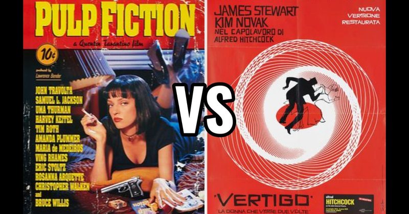
Pulp Fiction (1994) = Bold and stark minimalism
Vertigo (1958) = Complex, spiraled intrigue
See full Movie Poster rankings →Pick Your Favorite
VS
Your GOAT List
The Real Debate
Pulp Fiction explodes with its chaotic narrative and stylish violence, while Vertigo mesmerizes with its methodical pacing and psychological depth. This battle pits Quentin Tarantino’s brash, nonlinear storytelling against Alfred Hitchcock’s masterful suspense building, igniting fierce debates among cinephiles who champion their distinct tastes in movie magic. One film thrives on audacity and sharp dialogue, the other on intricate plotting and atmospheric tension. It's a showdown of bold modernity versus classic elegance, each poster capturing the essence that defines their film's impact. Whose side are you on? Dive into the debate and cast your vote!
Head-to-Head Comparison
| Criteria | Edge | Why |
|---|---|---|
| Visual Impact | Pulp Fiction (1994) | Pulp Fiction's bold typography and stark imagery create a more striking and memorable visual impact. |
| Design Complexity | Vertigo (1958) | Vertigo's poster features a more intricate design with its spiraling patterns and layered images, showcasing greater complexity. |
| Theme Expression | Vertigo (1958) | The swirling motifs and dizzying composition of Vertigo's poster effectively capture the film's themes of obsession and disorientation. |
| Originality | Vertigo (1958) | Vertigo's use of a unique spiraled design and psychological depth stands out as more original compared to the minimalist style of Pulp Fiction. |
🔥 Fan Takes
How Fans Are Voting
Latest battle odds:
Pulp Fiction (1994): 71%
Vertigo (1958): 29%
Overall battle results:
Overall fans prefer Pulp Fiction (1994) over Vertigo (1958) when it comes to the greatest Movie Posters of all time. In head-to-head matchups, fans pick Pulp Fiction (1994) 74.4% of the time over Vertigo (1958).
Across all battles:
Pulp Fiction (1994) win rate: 44.8%
Vertigo (1958) win rate: 23.2%
Fan FAQs
Why is this matchup between Pulp Fiction and Vertigo such a big debate?
This one's a classic clash of styles! Pulp Fiction's bold, vibrant flair goes head-to-head with Vertigo's more sophisticated elegance, and both fanbases are passionate, making it a heated discussion!
What makes Vertigo so popular?
People love Vertigo for its artistic depth and psychological intrigue. Hitchcock really nailed the suspense, and the poster itself is a classic that's visually stunning!
Why is Pulp Fiction winning by so much?
Fans are all about that iconic retro vibe and unforgettable characters. Plus, the sheer nostalgia and cult following from Quentin Tarantino's style is hard to beat!